The admin panel
The admin panel is Ruscker’s main advantage over editing YAML by hand.
It lives at /admin, uses account login after token-based bootstrap,
and needs a catalog database: SQLite with serve --db <file>, or shared
Postgres with --config-db-url in HA.
Everything is configurable from the web UI — every spec field (including API, scaling, resource and lifecycle settings), the media library, encrypted credentials, and the whole landing page. YAML import/export exists for migration and backups, not as a requirement.
The admin panel and the public portal both work on a phone: the top navigation collapses to icons, wide tables and the dashboard’s replica grid scroll inside their cards (rather than stretching the page), and the portal’s app cards go full-width and show their whole description up front — the desktop hover-to-expand isn’t needed on touch.
Logging in
On first run, set RUSCKER_ADMIN_TOKEN (the .deb generates one on
install and prints it once) and browse to /admin/login: with no
accounts yet you’re asked for the token, then walked through
creating the first admin account (username + password). After that
everyone signs in with their account at /admin/login. The token stays
as a break-glass login (/admin/login?token=1) so you can never be
locked out. Until a token is set, /admin/* returns 503 and only the
public landing + proxy are served.
The top-right account cluster has the same language (pt-BR / en-US / es-ES / fr-FR) and theme (light / dark / auto) pickers as the public portal, plus your current access level and account actions.
Users and access levels (roles)
Each person gets their own account (username + password). Admins manage
accounts under Users (/admin/users): create one, or open a row’s
Edit button for the consolidated page — role, groups and profile in
one form with a single save, plus the password reset. Each row shows a
coloured avatar with the user’s initials and their groups as coloured
badges (a group keeps the same colour on the Groups and Apps pages).
The table is paginated on the server at 50 users per page. Its
server-side, case-insensitive search (accented letters included — GESTÃO
matches Gestão, though it does not strip diacritics, so Joao won’t find
João) covers username, groups, department, email and phone on both SQLite
and Postgres.
Passwords follow a policy: at least 8 characters, with at least one
uppercase letter, one lowercase letter, one digit and one special
character — enforced everywhere a password is set (create, reset,
first-admin setup, self-service change, CSV import). Existing passwords
aren’t retroactively rejected; admin-assigned ones are transitional
anyway, because the user is asked to change theirs on first login. Next
to the password field, a generate button fills in a strong random
14-character password (created in your browser, policy-compliant, no
look-alike characters) and reveals it so you can read what you’re about
to hand over — no more teste123. Password fields are masked (type
password) throughout the panel otherwise, so a shoulder-surfer can’t
read a password as you type it.
| Role | Can do |
|---|---|
| Viewer | a portal account, not a panel operator: signs in to unlock group-restricted cards on the landing; reaches no admin section |
| Editor | view + manage Apps and Media; view Containers and stop/restart replicas |
| Admin | everything, including managing users, credentials, the landing editor, custom blocks and the audit log |
The panel shows only the sections your role can reach. Enforcement is
server-side — hiding a nav link is just UX; the routes themselves
return 403 for a role that isn’t allowed. The audit log records the
acting username. A last-admin guard stops you deleting or demoting
the only remaining admin (so the portal can’t be locked out); the
RUSCKER_ADMIN_TOKEN break-glass login is the other safety net.
2FA / MFA for selected apps
In an app’s Access & scale settings, enable Require 2FA
(require-mfa) to require a user-owned authenticator-app code before the
proxy will select or start that app’s container. The same enrolled TOTP
factor is reused across protected apps; the switch is a per-app step-up
policy, not a separate enrollment for every app.
Users enrol once under Account → 2FA, either directly or when a protected app redirects them there. They re-enter their password, scan the QR code with a standard TOTP app such as Google Authenticator, Microsoft Authenticator, Authy or 1Password, confirm a six-digit code, and save the one-time recovery codes shown once. One successful proof satisfies every protected app, subject to each app’s freshness policy.
MFA validity days (mfa-validity-days) controls that policy: 7 days by
default, capped at 30; 0 limits the proof to the current login session.
The proxy checks it before any container is selected or started. An
unenrolled or unproven /app visit redirects to enrolment or challenge
without spawning; protected /api requests return 401 without a login
and 403 when proof is still required.
Users can open Two-factor authentication in their account to forget
this device or forget all trusted devices without ending their login
sessions. If a phone or recovery-code set is lost, an Admin can open the
user’s edit page and Reset 2FA; this deletes the factor, recovery codes
and device grants, so the next protected-app visit starts guided enrollment
again. The RUSCKER_ADMIN_TOKEN remains an audited break-glass bypass for
emergencies and should not be used for routine app access.
The remembered-device cookie is opaque and HttpOnly; only its salted hash
is stored. Password change/reset, 2FA reset, user deletion and Forget all
trusted devices revoke remembered proofs. TOTP secrets are encrypted with
RUSCKER_MASTER_KEY; enrolment fails closed with 503 when the key is
missing. Secrets and recovery-code plaintext never enter logs, audit rows or
YAML exports. The flow works with both SQLite and Postgres; an Admin sees
only whether 2FA is configured and can perform the audited reset.
Identity headers to apps
For an app that needs the portal identity, enable
add-default-http-headers: true. Ruscker then sends the
ShinyProxy-compatible X-SP-UserId and X-SP-UserGroups headers. Unlike
ShinyProxy, Ruscker defaults this off so upgrading or importing a spec does
not disclose identity unexpectedly.
Independently, use identity-claims: [email, setor] to opt into profile
fields as X-Ruscker-User-Email and X-Ruscker-User-Setor. A claim with
no stored value is omitted. These headers are forwarded only for signed-in
users and work on both HTTP requests and WebSocket handshakes.
Treat them as trusted identity only when the app is reachable exclusively
through Ruscker. The proxy strips all client-supplied X-SP-* and
X-Ruscker-User-* headers before inserting its authoritative values, which
prevents direct request spoofing at this boundary.
Screens
The sections below follow the panel’s tab order: daily drivers first (Containers, Apps, Media, Credentials, Appearance, Schedules), people (Users above, Groups), then diagnostics and maintenance (Logs, Disk, Activity, System). The former Dashboard/Painel nav label is now Containers, and Audit/Auditoria is Activity/Atividades. Core module headings use the standardized “X Management” / “Gestão de X” pattern; technical notes sit in helper text instead of subtitles.
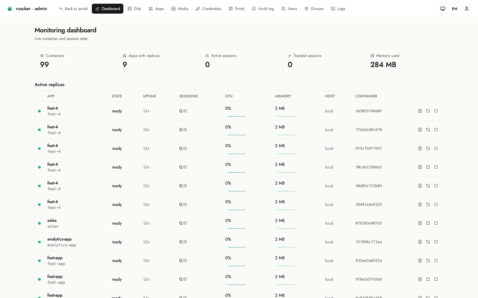
Containers
A live view of running replicas, refreshed by polling
GET /admin/dashboard/snapshot. The
headline KPI cards (containers, apps with replicas, sessions, memory)
count up on load. Below them, replicas are grouped by app in
expandable cards: each card’s header summarises the app — replica count,
worst replica state, and aggregate sessions / CPU / memory with little
meters — and expands to the per-replica detail (state, container id,
uptime, sessions, CPU, memory) with stop / restart / logs actions.
A toolbar offers an expand/collapse-all control. Shows a banner when
started without --docker. Stop and restart take a few seconds (drain,
signal, and a respawn for restart), so while one runs the replica row
dims, its buttons disable to prevent a double-fire, and the clicked
action shows a spinner.
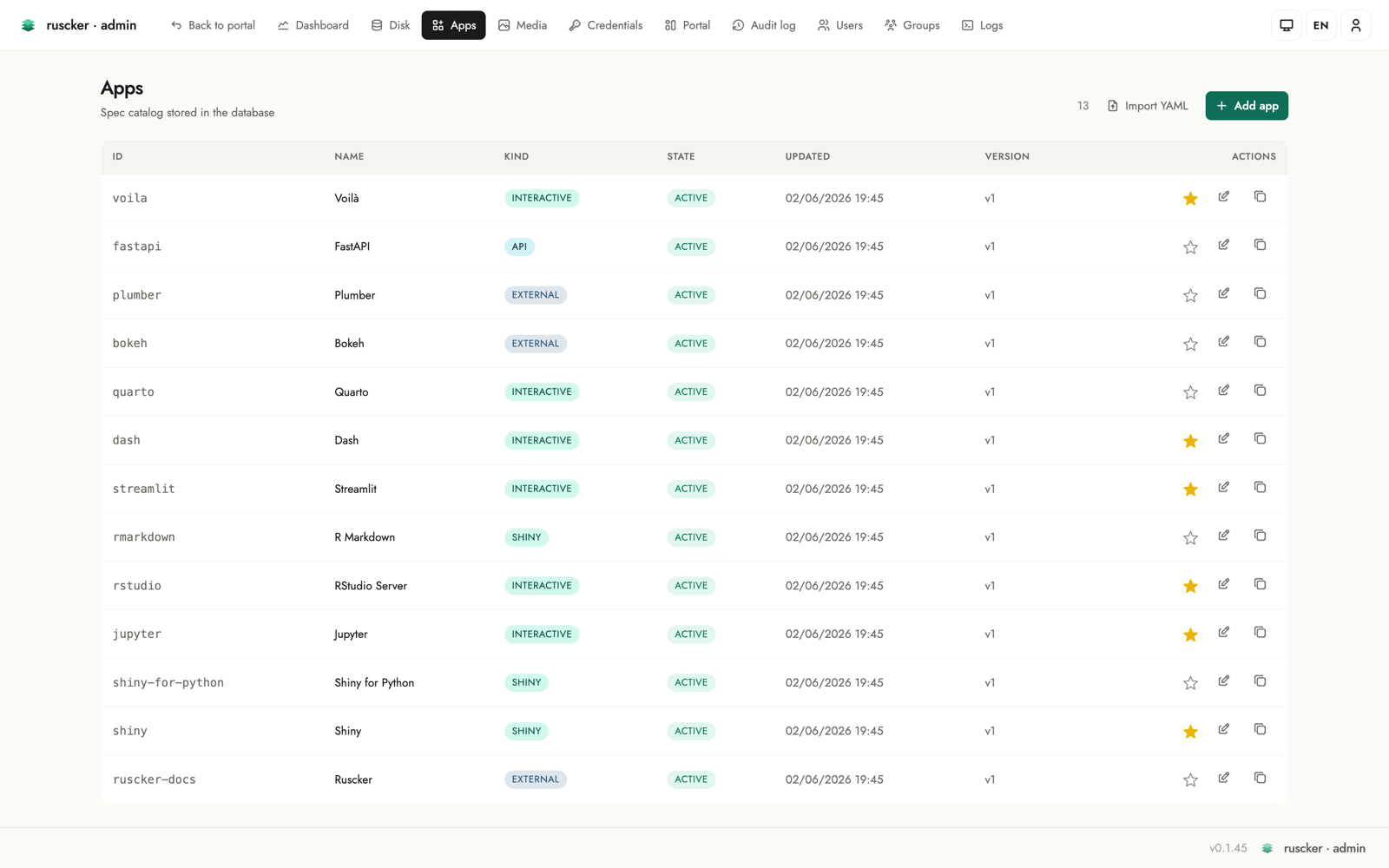
Apps
The list of specs — apps, APIs and external links — with create, edit and delete. Each row shows the app’s framework logo next to its name, a colour-coded kind pill, and an Access column with the spec’s access-group badges (or a globe + “public” when ungated). Each row also has a featured star next to the actions: click it to toggle whether the app appears in the landing page’s Featured carousel, inline, without opening the editor (solid = featured).
The Actions column also carries an archive toggle and a delete
button. Archiving deactivates the app in place — its card leaves the
public portal but the configuration, history and audit trail stay, and
one more click brings it back. The toggle updates the row right where
it is (no reload, no scroll jump, and the row keeps its position in the
list — archiving doesn’t count as an “update”). Delete asks for
confirmation, stops the app’s containers and is audited; apps defined
in the serve --config YAML stay read-only here.
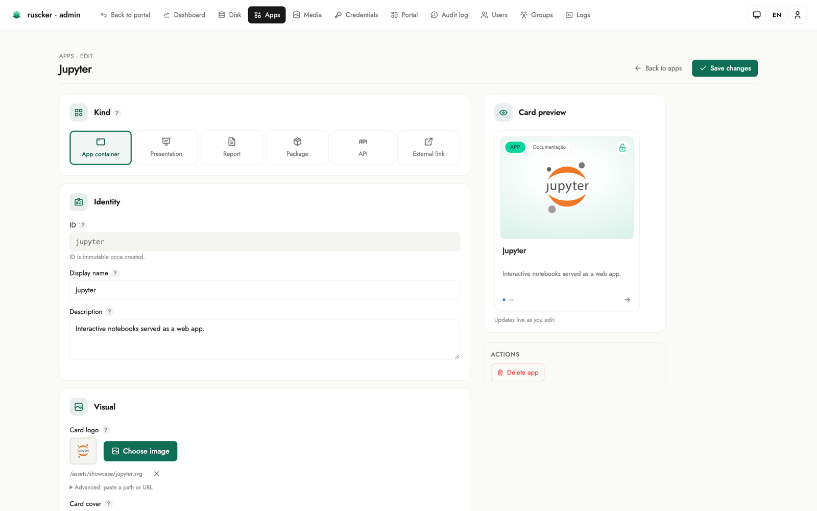
The add/edit form walks down the page in the order you think about an app: Identity (id, name, subject), Kind (app container / presentation / report / package / API / external link), Description, Appearance (card logo via a searchable modal picker over the media library, an accent colour that tints the card, a monogram fallback for logo-less cards, and a solid/gradient cover builder), and Access & scale (a Restricted-access toggle with group/user pickers, an Access-lock toggle, an Autoscaling toggle, and an initial-replicas stepper). A live card preview on the right updates as you type, and a “?” help popover on every field explains what it does.
The two access controls are independent. Restricted access is real enforcement: Ruscker only lets the listed groups/users (and admins) see and open the app. Access lock is purely a label — it closes the card’s padlock to signal that the app authenticates on its own (its own login screen), without Ruscker restricting anything. So an app that’s visible to everyone but asks for its own password gets the Access-lock toggle and no group list.
When you save a brand-new app, a confirmation dialog opens in the centre of the screen: it confirms the app was created and asks where to go next — back to the form to keep editing it, or straight to the apps list. Editing an existing app just saves in place, with no prompt. The dialog is localized in all four interface languages.
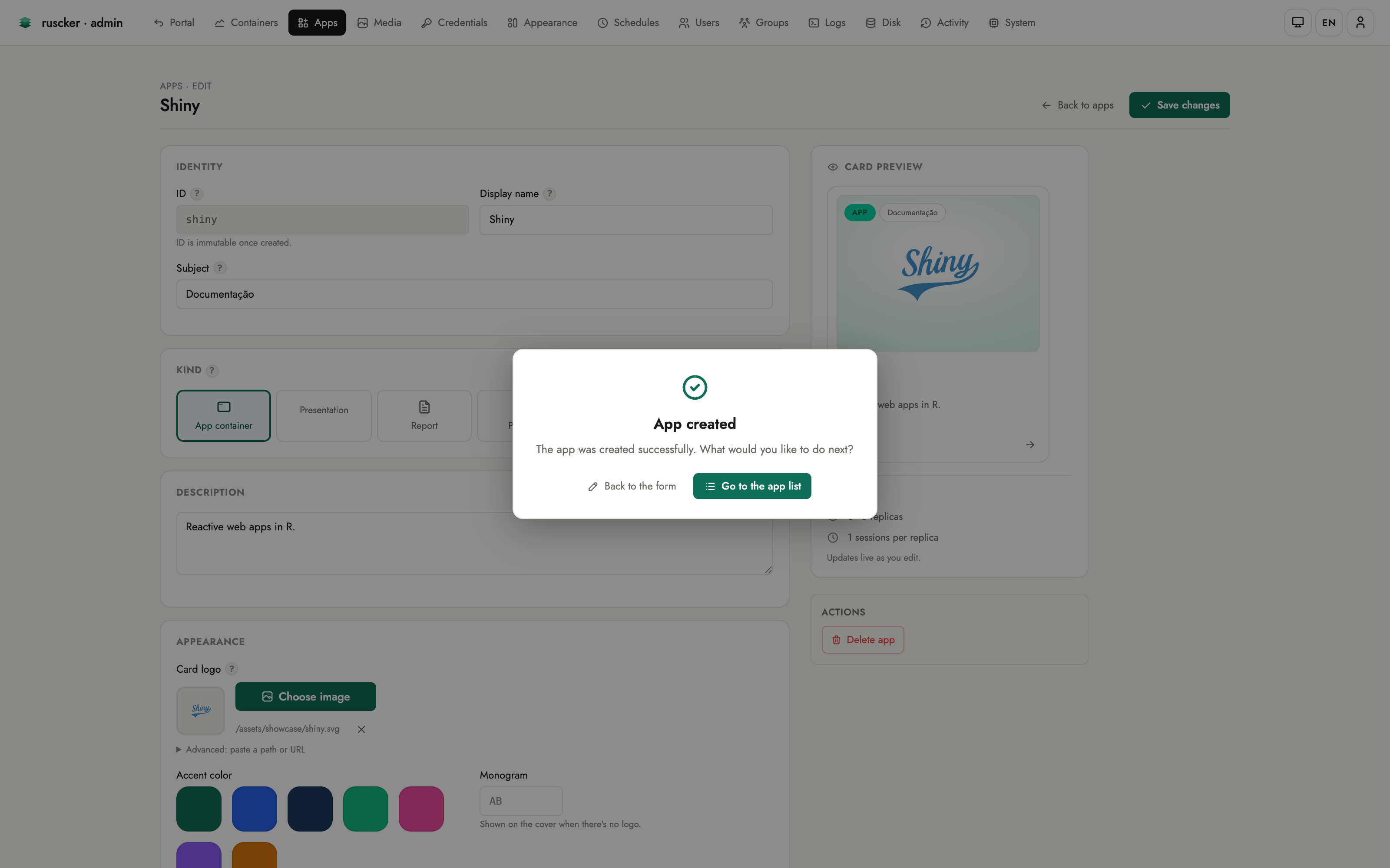
Two editors can have the same app open without trampling each other: the form carries the version it was loaded against, and a stale save is rejected with a conflict banner (your input intact) instead of silently overwriting the other person’s changes.
Private images. Right under the Docker-image field, a Check button reports whether the image is already on the host, and a Pull / Update image button fetches (or re-fetches) it on demand with live progress — handy after re-publishing the same tag (new build, or a corrected CPU architecture). A credential picker sits next to the image field: pick a saved registry credential and Ruscker pulls private images with it. Docker Hub credentials are normalised to the canonical registry address so they apply reliably, and a pull failure names how it authenticated (anonymous vs. the user/registry). If a container crashes on startup, the dashboard and logs show the container’s own error output and exit code — not a generic “no port binding”.
Under the collapsible Advanced band, every remaining spec option is editable too — so an app can be configured end-to-end from the web UI, without touching YAML:
- Runtime — seats per container, session lifetime, inner container port and platform.
- API (for
type: api) — container port, rate limit, docs/health paths, permissive CORS. - Scaling — min/max replicas and concurrent requests per replica.
- Resources — per-container CPU and memory limits.
- Lifecycle — the heartbeat (idle-session) timeout.
Every advanced field is optional; leaving it blank keeps Ruscker’s default, so the section stays out of the way until you need it.
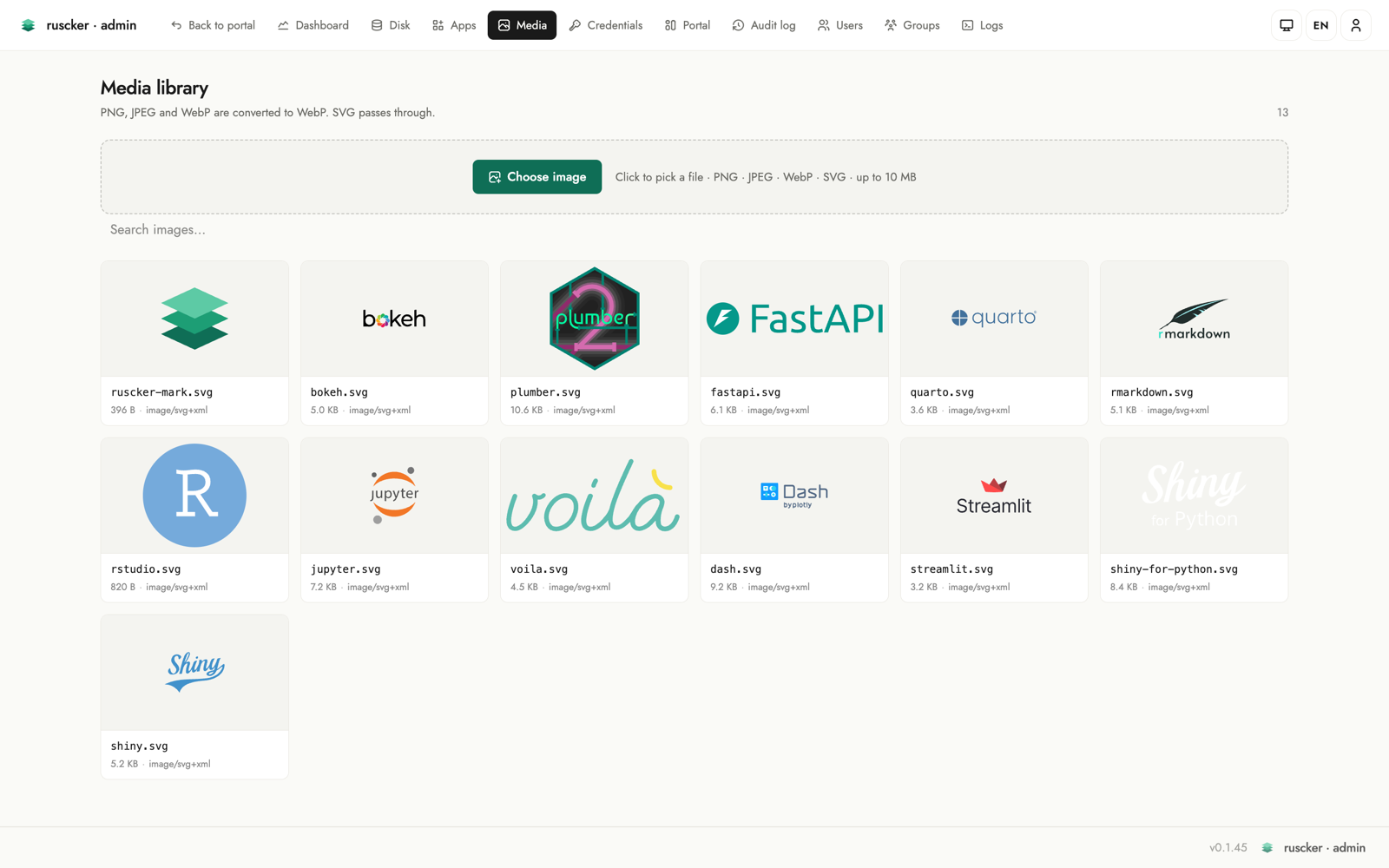
Media
Upload images (PNG/JPEG → WebP), served at /assets/img/<file>. These
are the card logos and covers.
The gallery is a single unified library — built-in logos (brand marks shipped with Ruscker) are seeded here automatically alongside your uploads. Every image can be deleted from the gallery; if it is referenced by any spec logo/cover or landing logo, the entry shows an “in use” badge so you know before deleting.
Uploading a file whose name already exists keeps both images: the
new one is stored under a free name (logo.webp → logo-2.webp) and
the flash tells you the stored name — nothing that references the
original changes. The gallery sorts newest-first, so the renamed upload
is the first tile.
When editing a spec you can open a modal picker (search, browse, drag and drop, or upload inline without leaving the form) to select a logo or cover. A “Choose image” button auto-uploads on file select for a one-click flow; inline uploads auto-select the stored (possibly renamed) file, and every picker tile shows a filename caption, so look-alike images are easy to tell apart.
Credentials
A named, AES-256-GCM-encrypted store for registry credentials (needs
RUSCKER_MASTER_KEY). Passwords never appear in the YAML or in the
panel after saving. Each entry accepts either a literal password
(encrypted at rest) or a pure ${VAR} env-ref — stored verbatim and
resolved to the real value only at container pull time.
In the spec form the Registry section is a credential picker: type or select the name of a stored credential and Ruscker resolves it at spawn. There is no need to inline registry passwords in a spec.
Appearance
Customise the public landing without a custom template. Every control is mirrored instantly in a live portal preview on the right — the preview has its own ☀️/🌙 switch so you can inspect both themes without changing the saved default, and the action bar carries a “Restore defaults” button (with confirmation) that resets the styling while keeping titles, logos, texts, SEO, custom CSS and HTML blocks:
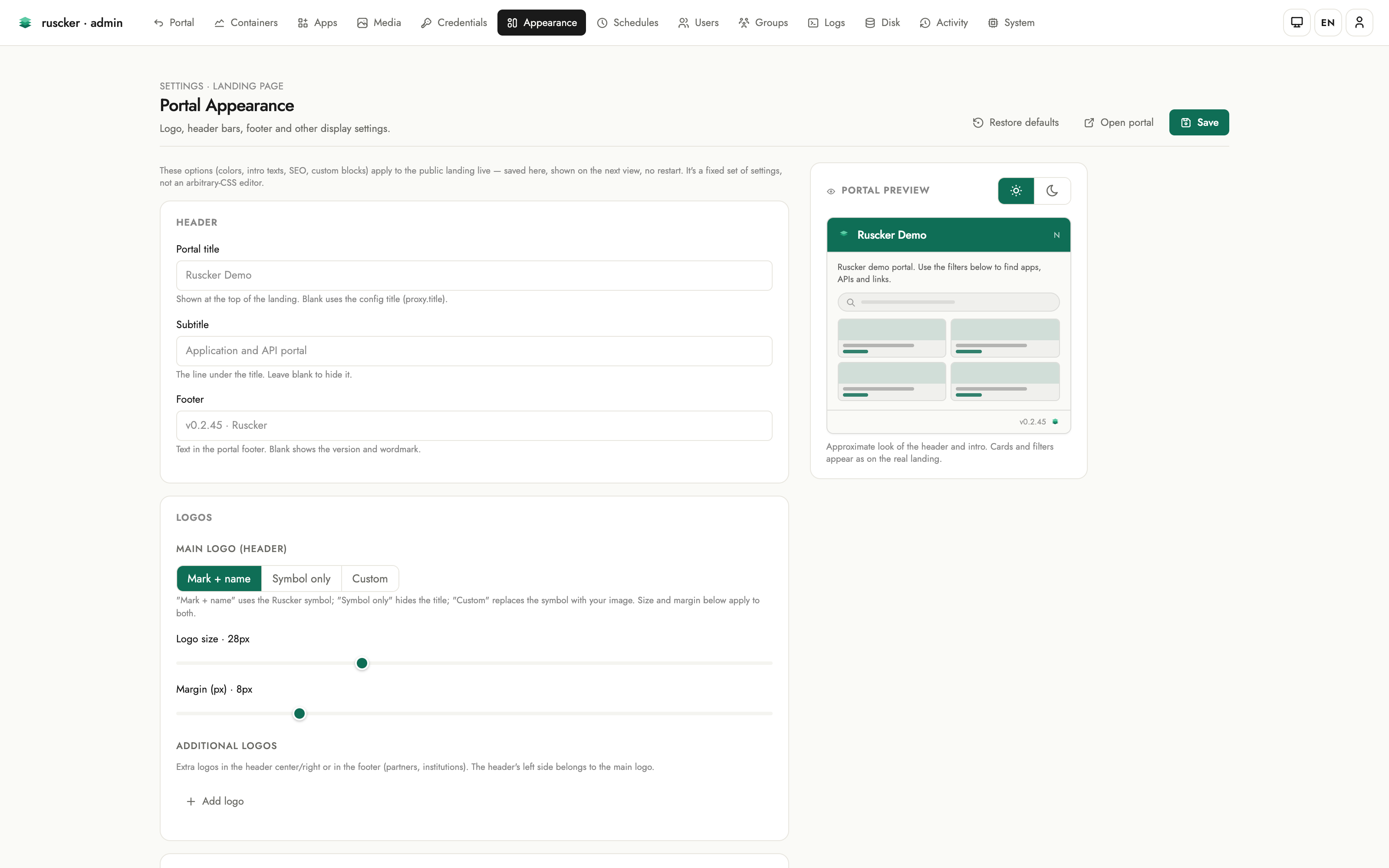
- Header — the portal title, subtitle and footer texts.
- Logos — the main header logo in one place: built-in mark, symbol-only, or a custom image picked right there from the Media library, sized by its own sliders. Additional logos go in the header centre/right or the footer, each with alignment, an optional click-through link and a height.
- Header style — the background is one explicit choice: Preset (flat / soft / bold tints), Solid or Gradient — and the custom modes carry separate light and dark values (dark inherits light until you set it). Text colour is per-theme too.
- Catalog cards — the default cover behind cards that have no cover of their own: Auto keeps each type’s tint colour (zero configuration), or paint a solid / gradient per theme, with a live cover preview, a draggable angle dial and an explicit Inherited ⇄ Own pill on the dark side.
- Theme & colors — the default theme (light / dark / auto) for first-time visitors, brand-colour quick swatches (plus a custom pick), and full light/dark palettes with a live mini-preview of background, text and accent.
- Catalog layout — grid, list or sections as large icon tiles, plus a comfortable/compact density bar.
- Visible sections — toggles for the search box, the filter chips and the Featured carousel.
- Content — a per-locale intro paragraph (rendered full-width and
justified on the portal) and the footer text. The intro understands
an inline slice of Markdown —
**bold**,*italic*and[links](https://…)— never raw HTML; the preview renders it the same way. - SEO & sharing — page title, meta description,
og:image, with a live Google-style search-result preview that updates as you type. The landing<head>emitsdescription+og:*+twitter:card. - Analytics & custom code — pick a provider (GA4 / Plausible / Matomo) and paste just the site key — Ruscker builds the snippet and widens only the landing’s CSP for that provider’s origins. A raw HTML field remains as the escape hatch for anything else. The custom-CSS and analytics/HTML fields are syntax-highlighted code editors (the custom HTML blocks editor too).
Blocks
Custom HTML blocks rendered in the landing top (after the header) and
bottom (after the card grid) slots, edited inline at the bottom
of the Appearance page: “+ New block” (or a row’s pencil) expands the
editor right there — name, a Top/Bottom position switch, a
syntax-highlighted HTML editor, CSP origins for any third-party content
it embeds, and an active toggle. Rows reorder by drag-and-drop or the
↑/↓ buttons, each slot shows a block counter, and after saving you land
back at the blocks section.
Block and analytics HTML is rendered verbatim on the public landing. It’s admin-only input — the intentional escape hatch — so only paste HTML you trust.
Schedules
Cron-scheduled, run-to-completion jobs (Admin-only) — nightly ETL,
report generation, cache warm-ups. Local Docker backend only — the
multi-host backend does not run jobs, so a due schedule there is recorded
as an error. A schedule picks one of your
containerized apps and runs that app’s image with the same
environment, volumes, resource limits and registry credentials a normal
replica gets, optionally overriding the command (one argv element per
line; leave it empty to run the app’s own container-cmd, or the
image’s baked CMD). External apps can’t be scheduled — there is
nothing to run.
Semantics worth knowing:
- No run on creation. A new schedule waits for its next cron occurrence (times are UTC).
- Downtime collapses. If the server was down across several occurrences, the schedule fires once on the next tick — ETL semantics, not a message queue.
- Leader-only in HA. With several active-active instances, only the scaler leader fires schedules, and a database claim backstops a split brain so an occurrence never double-fires.
- Timeout. Each run is capped — 1 hour by default, or the per-schedule Timeout (minutes) when set. A run over the cap is killed and recorded as an error.
- History. The Latest runs table shows each run’s status (
ok/failed= non-zero exit /error= couldn’t run), exit code, duration and an expandable log tail. - Alerts. A failed run raises a
job-failedalert through the webhook configured in the System tab (see below).
Groups
Groups (/admin/groups, admin-only) gate which apps a user sees. They’re
derived, not a separate table: a group exists as long as a user belongs
to it or an app lists it under access-groups. The page shows every group
with its members and the apps it gates, and lets you edit them in place:
- Rename a group — the change propagates across every user membership and every app that references it.
- Delete a group — it’s removed everywhere (an app left with no groups becomes open to all).
- Add / remove members inline, and create a group by adding its first member under a new name.
Edits touch the database-managed users and apps. An app defined in the
serve --config YAML stays read-only here (edit the file for those).
Below the groups, Public apps lists every ungated app as a logo chip — the thumbnail sits on the catalog’s per-type tint colour, so the app’s kind reads at a glance — with a globe mark; clicking a chip opens that app’s editor.
Logs
The server log terminal updates in near real time through finite, cursor-based polls. Lines are colour-coded by level, with level chips (info / warn / error), an app filter dropdown, a line counter, and pause/resume + clear controls. Polling stops while the page is paused or hidden and resumes from the last cursor, catching up with lines still in the bounded buffer. A download link grabs the current buffer.
This page deliberately does not use EventSource: every poll completes
and releases its HTTP connection, so an HTTP/1.1 reverse-proxy hop cannot
retain the log response and head-of-line block later admin navigation. The
per-replica container log viewer is separate; its Live button opens an
SSE follow stream only when requested by an operator.
Disk
Storage at a glance (Admin-only). A usage hero shows host disk used / total with a percentage and a stacked bar split into Ruscker images, other used, and free. Below it, two panels list the Ruscker-managed containers and images — each removable, with an “in use” cross-reference so you don’t delete something a running app or the effective catalog needs, plus bulk “prune stopped containers” and “remove unused images”.
The Volumes card lists named Docker volumes with live reference counts
across all host containers. Local Docker backend only — with the
multi-host backend the Disk page reports volumes as unavailable. Volumes created here receive the
ruscker.created label. Removal is offered only when Ruscker created the
volume, no container references it, and no effective catalog spec names it;
the server rechecks all three conditions before asking Docker to remove it.
Activity
The Activity section holds two tables, switched by a pill toggle at the top of the page.
Atividades dos usuários (user activity) lists who signed in and who opened which app:
- a login is recorded when a user signs in with a password;
- an app access is recorded once per new interactive app session — a genuine visit, never counted for a page’s assets, XHR calls or WebSocket frames, and API calls keep only their aggregate access counter. An access with no signed-in user shows as Anonymous.
Filter by event kind, user, app, and time window (last 24 h / 7 / 30 days), with server-side pagination for a long history. The history carries no foreign keys to users or apps, so removing a user or an app doesn’t erase the record of past activity. Events are captured off the proxy’s hot path — a non-blocking enqueue plus a background writer that batches inserts — so activity logging never slows a request. The client IP is not stored in this release (it’s personal data; a future opt-in would come with a retention policy).
Atividades administrativas (administrative audit) records every admin mutation (spec/image/credential/landing/block changes, imports) with actor, action, target and timestamp. Destructive replica stop/restart, schedule changes, MFA enrolment/reset/proof, and break-glass MFA bypasses are recorded too; rows with a change diff expand to show it.
System
A read-only diagnostic of the running server (version, bind address, base path, Docker and database status, catalog and replica counts, forwarded-header trust, HA leadership), plus one operational control: the alert webhook.
Set a URL there and Ruscker POSTs a JSON payload when something an
operator should know about happens:
spawn-failed— a container failed to start for an app (fires with the same dedup as the log warning, so a crash-looping image doesn’t storm the channel);replica-down— a running container died outside Ruscker’s control (crash, OOM, external stop) and was pruned;saturated— an app is full atmax-replicasand visitors may be turned away;job-failed— a scheduled job exited non-zero or could not run;test— the Send test alert button, for checking the wiring.
The payload:
{
  "event": "replica-down",
  "spec": "sales-dashboard",
  "replica": "d3f2…",
  "message": "human-readable summary",
  "occurred_at": "2026-01-01T12:00:00Z",
  "ruscker": { "version": "x.y.z" }
}
Delivery is best-effort: 5 s timeout, three attempts with a doubling
pause, and a per-(event, app) cooldown of 15 minutes so a stuck
condition re-alerts occasionally instead of continuously. Point it at
anything that accepts a JSON POST — a Slack/Mattermost incoming-
webhook adapter, ntfy, an n8n/Zapier hook, or your own endpoint.
Leave the URL empty to turn delivery off. Changes are audited (the
URL’s value itself is never written to the audit log — it may embed a
token).
Config vs. database
serve --config supplies service settings and any YAML-managed specs. The
admin panel reads and writes the catalog database: SQLite with --db, or
Postgres with --config-db-url. ruscker import can populate either from
YAML. For SQLite, ruscker export --db <file> reconstructs the portable
configuration, including specs, landing customization, SEO/analytics and
custom blocks; credential and MFA secrets are not exported.
Importing card images into the Media library
A spec’s logo/cover is a reference like /assets/img/snap_aurora.png;
the YAML doesn’t carry the image bytes. ruscker import ingests those
binaries into the Media library from a directory, keeping each file’s
original name so the references resolve:
ruscker import application.yml --db ruscker.db \
  --images-dir /etc/shinyproxy/templates/<tpl>/assets/img
When --images-dir is omitted it’s auto-discovered next to the config
just like serve (<config-dir>/assets/img/, then the ShinyProxy
template-path layout). The import is idempotent — files already stored
with identical bytes are left untouched. (Unlike an admin upload, the
import keeps the original format rather than transcoding to WebP, so the
existing references keep matching; re-upload through the Media page to
optimize.) Without a Media copy, logos only render if serve is also
pointed at the same --images-dir (the on-disk fallback).